By using our site you agree to our use of cookies to deliver a better site experience.
Our customer, Kermetico wanted to update and redesign their corporate website. After evaluating the situation, we determined we could meet all preliminary requirements within the budget, and the project began.
After all requirements were elicited, analyzed and recorded, we form the tasks list:
Create a new, industry-relevant brand identity and design.
Investigate the core audience and plan UX tailored to their needs.
Achieve a high level of quality.


Front-end developer
Back-end developer
QA Engineer
Project manager
Web-designer
Estimated working scope
Estimated development duration

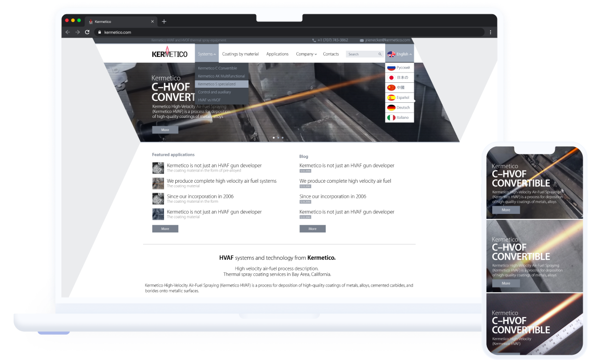
At the outset, the company had no established identity elements, so we began the project by focusing on its branding. The identity and design we created were highly industry-specific.
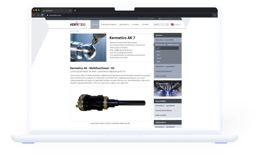
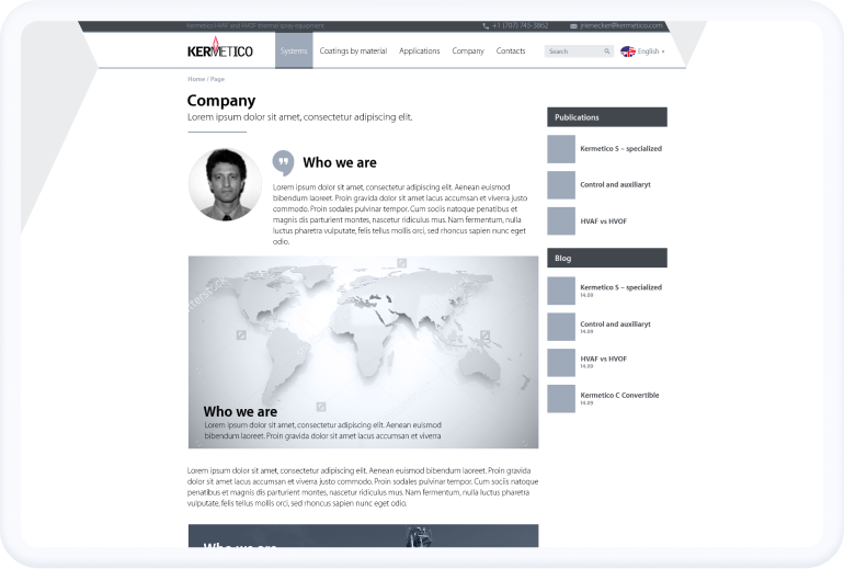
The design prominently features equipment photos, informational charts, and diagrams, emphasizing the company’s scientific foundation. While the style might appear unconventional to outsiders, it resonates well with industry insiders. We conducted polls to validate this approach and received positive feedback.
We prioritized understanding the core audience in detail. Our research revealed that the typical consumer is a tech-savvy person in their forties, often with impaired vision due to the nature of electric welding. To address this, we implemented accessibility features for the visually impaired, adhering to the WCAG 2.0 accessibility standard.
From the outset, the customer provided us with extensive content that required precise positioning on the site pages. We meticulously organized this content, ensuring it met all user considerations and expectations.
Another critical and labor-intensive feature we incorporated is Schema.org-compatible semantic markup. This allows users to see site paragraphs with descriptions and even rankings directly in search results, which is particularly beneficial for busy tech workers who prefer accessing information in a concise format.

Another challenge was achieving pixel-perfect layouts and minimizing errors. Given the backend’s relative simplicity, potential HTML/CSS errors were the primary concern. We thoroughly addressed these issues through multiple rounds of testing and error correction. The final test revealed zero HTML and CSS errors, as confirmed by the W3C Markup Validation Service. Regarding the layouts, we worked diligently to meet the customer’s standards, achieving precision within a few review sessions.
The developed solution has significantly benefitted the customer. With its assistance, Kermetico has expanded its presence in several foreign markets. The company has achieved strong brand awareness, which has given it a competitive edge in networking, its primary sales channel. Additionally, personalized communication on the site has resulted in a 6 percent increase in the visitors-to-buyers conversion rate.


You're one step closer to building your perfect product.
Talk to us by filling out the form and we’ll get back in 12 hours to you once we’ve processed your request.
Let's jump on a call to discuss all possible options.
Required scope, timeline and apr. price will be included if you provide us with the detailed information about your project.
We start working on your project considering your feedback and keeping you in the loop.